In this tutorial we will be using animation.css to animate the contents of bricks builder.
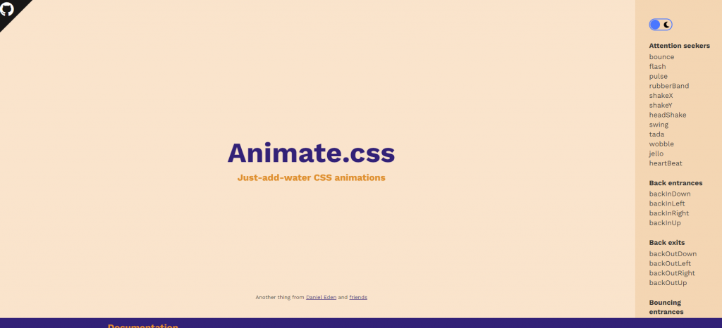
First of we need to check which animation we would like to apply by going to animate.css website.
Then go to the animate.css css file link here to search for the animation you want to use. Note that you just need to copy the @keyframes css code:
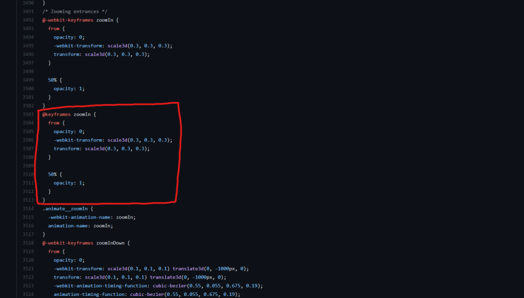
@keyframes zoomIn {
  from {
    opacity: 0;
    -webkit-transform: scale3d(0.3, 0.3, 0.3);
    transform: scale3d(0.3, 0.3, 0.3);
  }

  50% {
    opacity: 1;
  }
}
Then go to your Bricks builder and create a Slider component. Under Style click CSS and paste the keyframes css code you have copied earlier in the custom CSS. Add this code as well to target the active slide contents of your slider:
.swiper-slide-active  .slider-content{
  animation: zoomIn 1000ms ease-in-out;
}
By using this css selector we apply the animation on every active slide content, to further explain the css code ZoomIn is the Animation name while 1000ms is the Animation duration, and ease-in-out is the Animation timing function.
To learn the basic of animation in css you can check this reference.
Staggered Animation
For this animation we will target the individual inner content of the slider it’s composed of heading, description and button. The CSS selector for the heading is .title, for the description is .content, and for the button is .bricks-button.
You can copy this code below to follow the video’s sample:
@keyframes fadeInDownBig {
  from {
    opacity: 0;
    -webkit-transform: translate3d(0, -2000px, 0);
    transform: translate3d(0, -2000px, 0);
  }

  to {
    opacity: 1;
    -webkit-transform: translate3d(0, 0, 0);
    transform: translate3d(0, 0, 0);
  }
}

@keyframes fadeInLeftBig {
  from {
    opacity: 0;
    -webkit-transform: translate3d(-2000px, 0, 0);
    transform: translate3d(-2000px, 0, 0);
  }

  to {
    opacity: 1;
    -webkit-transform: translate3d(0, 0, 0);
    transform: translate3d(0, 0, 0);
  }
}

@keyframes fadeInUpBig {
  from {
    opacity: 0;
    -webkit-transform: translate3d(0, 2000px, 0);
    transform: translate3d(0, 2000px, 0);
  }

  to {
    opacity: 1;
    -webkit-transform: translate3d(0, 0, 0);
    transform: translate3d(0, 0, 0);
  }
}


.swiper-slide-active  .title{
  animation: fadeInDownBig ease-in-out 300ms;
}

.swiper-slide-active  .content{
  animation: fadeInLeftBig ease-in-out 500ms;
}

.swiper-slide-active  .bricks-button{
  animation: fadeInUpBig  ease-in-out 800ms;
}
In the code above the 800ms is the Animation delay, we need to adjust it accordingly to achieve the staggered effect.
For more Tutorials, Templates and other Free Resources always check our site and subscribe to our YouTube channel